v2.10.1 Font Size Optimization and UI Refinements
Overview
Improved readability with larger font sizes across all pages, plus enhanced layouts for Paper List and Data Input pages.
Font Size Optimization and UI Refinements
We’ve significantly improved readability across StarryData2 by increasing font sizes throughout the platform. This update was prompted by feedback from v2.10.0, where the introduction of superscript notation for units (e.g., cm⁻¹, mAh·g⁻¹) revealed that our previous 14px font size made these important scientific notations difficult to read. This led us to comprehensively review and optimize font sizes across the entire platform.
Primary Improvements
🔍 Enhanced Readability Through Larger Fonts
- Base font size increased from 14px to 16px across all pages
- Superscript units now clearly visible (addressing the readability issue from v2.10.0)
- Standardized text hierarchy for headers, body text, and annotations
- Optimized line heights for better text scanning
- Improved chart labels with better visibility in data visualizations
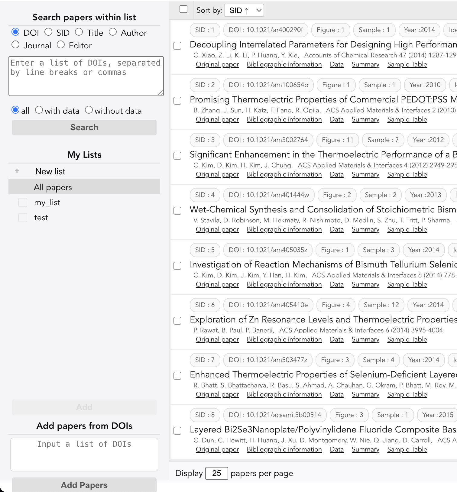
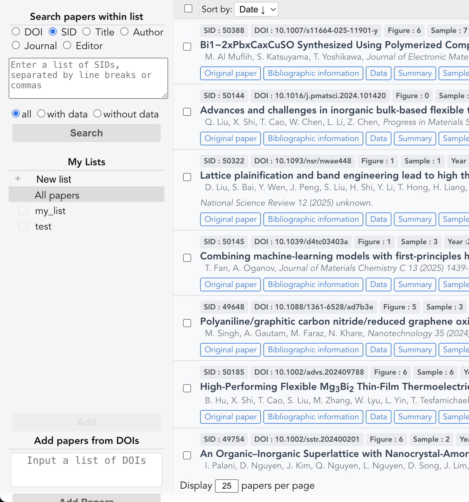
1. Paper List Page - Unified Design and Improved Typography
The Paper List page has been completely redesigned to align with the design language of other pages in StarryData2. Previously, this page had a different visual style from the rest of the platform. Now, with unified design patterns and larger fonts, it provides a consistent and more readable experience.
What’s Changed
- Design consistency unified with Data Input, Summary, and other pages
- Larger paper titles and author names for easier scanning
- Standardized layout patterns matching the platform’s design system
- Improved spacing between list items reduces visual clutter
- Cleaner visual hierarchy helps identify important information quickly
Before
After
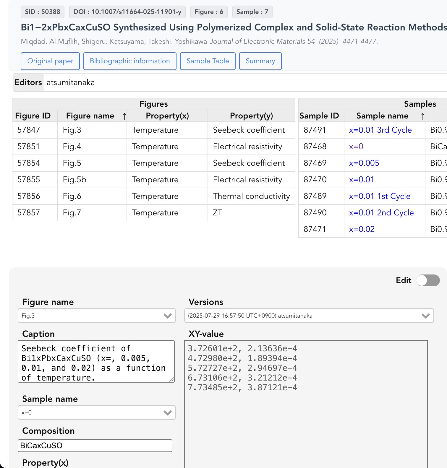
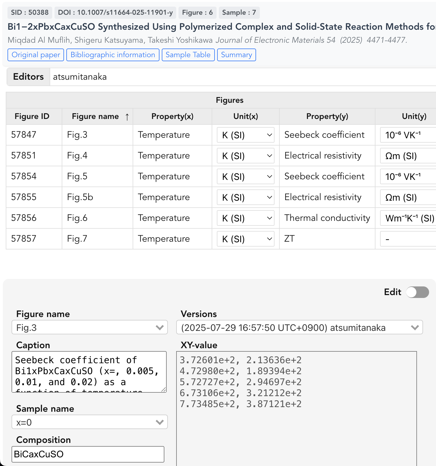
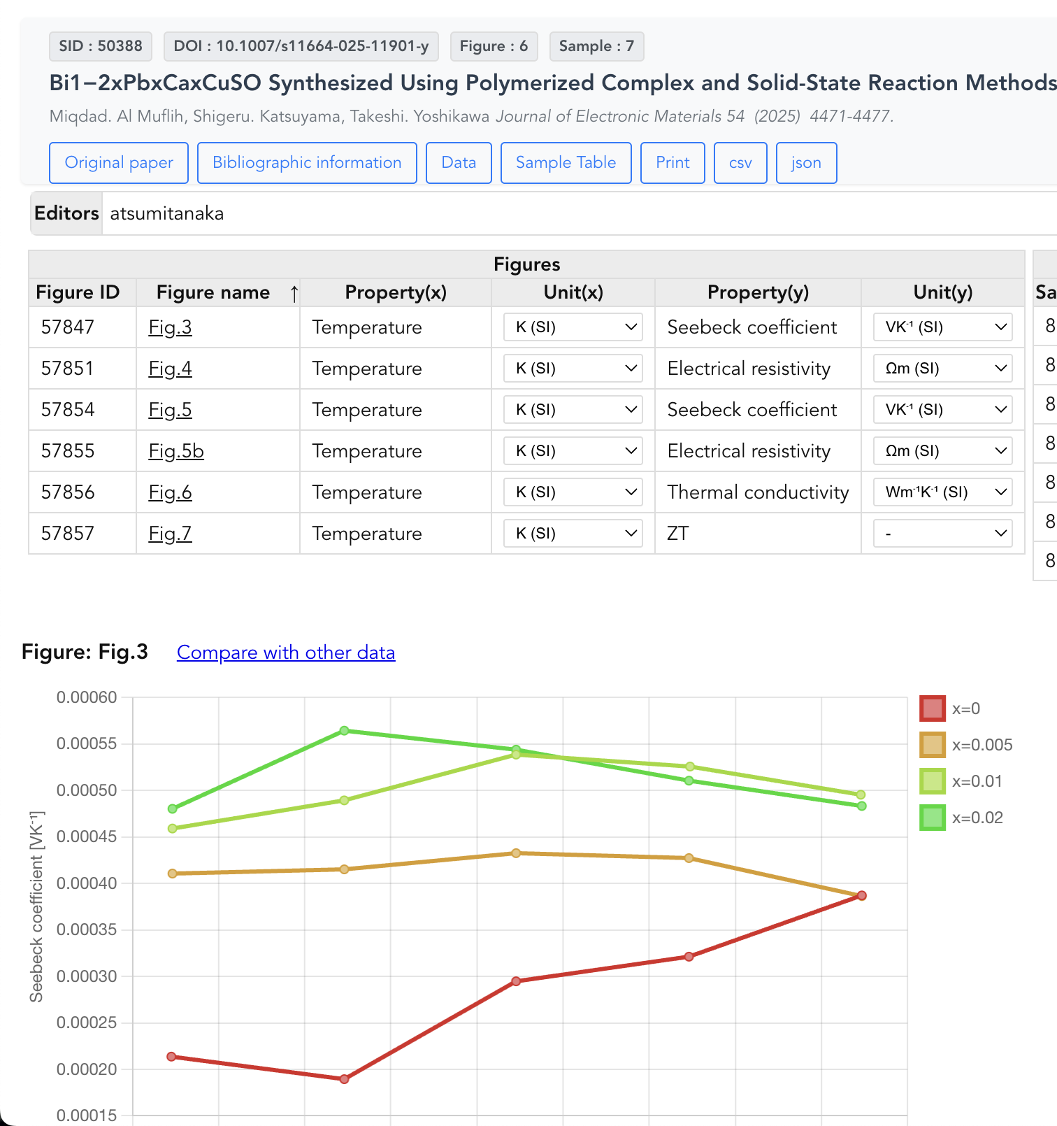
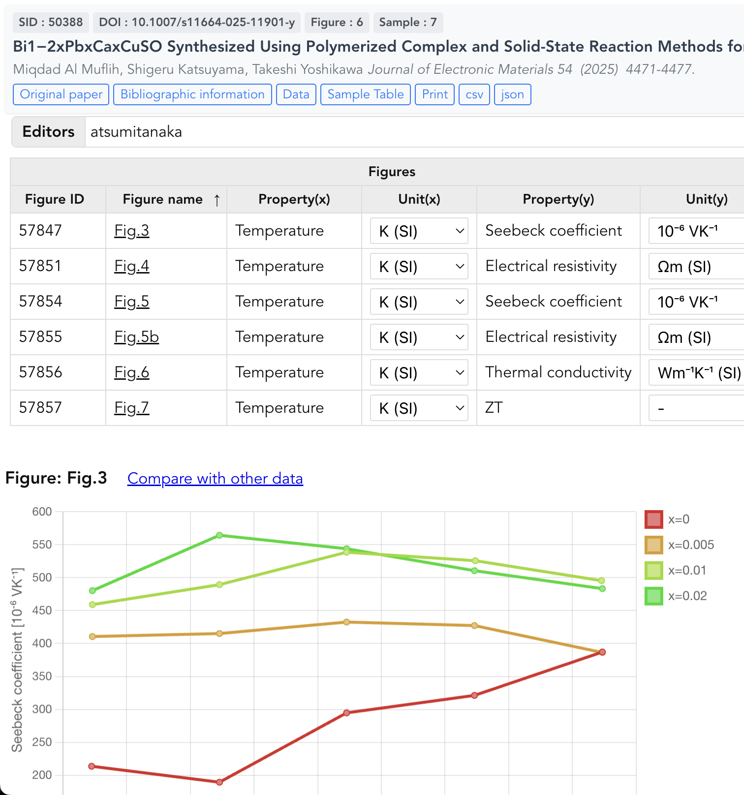
2. Data Input Page - Enhanced Figure List with Units
The Data Input page now features larger fonts and includes unit information directly in the Figure List. The increased font size particularly benefits the display of superscript units introduced in v2.10.0, making complex units like mAh·g⁻¹ and S·cm⁻¹ clearly readable.
What’s Changed
- Increased font size in input fields makes data entry less straining
- Unit display added to Figure List provides immediate context for measurements
- Superscript units now readable at the new 16px font size
- Better visual separation between different data sections
Before
After
3. Summary Page - Improved Typography
The Summary page benefits from the font size increase, making data summaries and analysis results easier to read and comprehend.
What’s Changed
- Larger text in data tables improves readability of numerical values
- Enhanced font weights create better visual hierarchy
Before
After
Summary
Version 2.10.1 prioritizes user comfort with a focus on readability improvements. The increased font sizes across all pages make StarryData2 easier to use for extended periods, while the layout refinements for key pages enhance the overall user experience. These changes reflect our commitment to making scientific data analysis more accessible and less visually demanding.
Thank you for your continued support!
Code contributors: Tomoya Mato