v2.5.0 Enhanced Usability for Data Input and Summary Screens
Overview
Property selection with recommended flags and natural order, quicken summary rendering, redesign graphs on input page, and unify table display.
1. Improvements Related to Properties
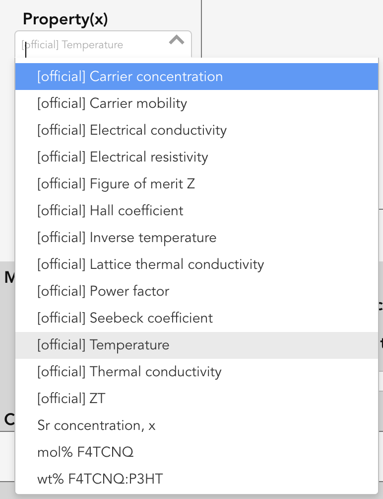
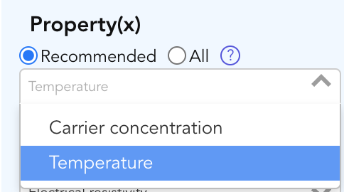
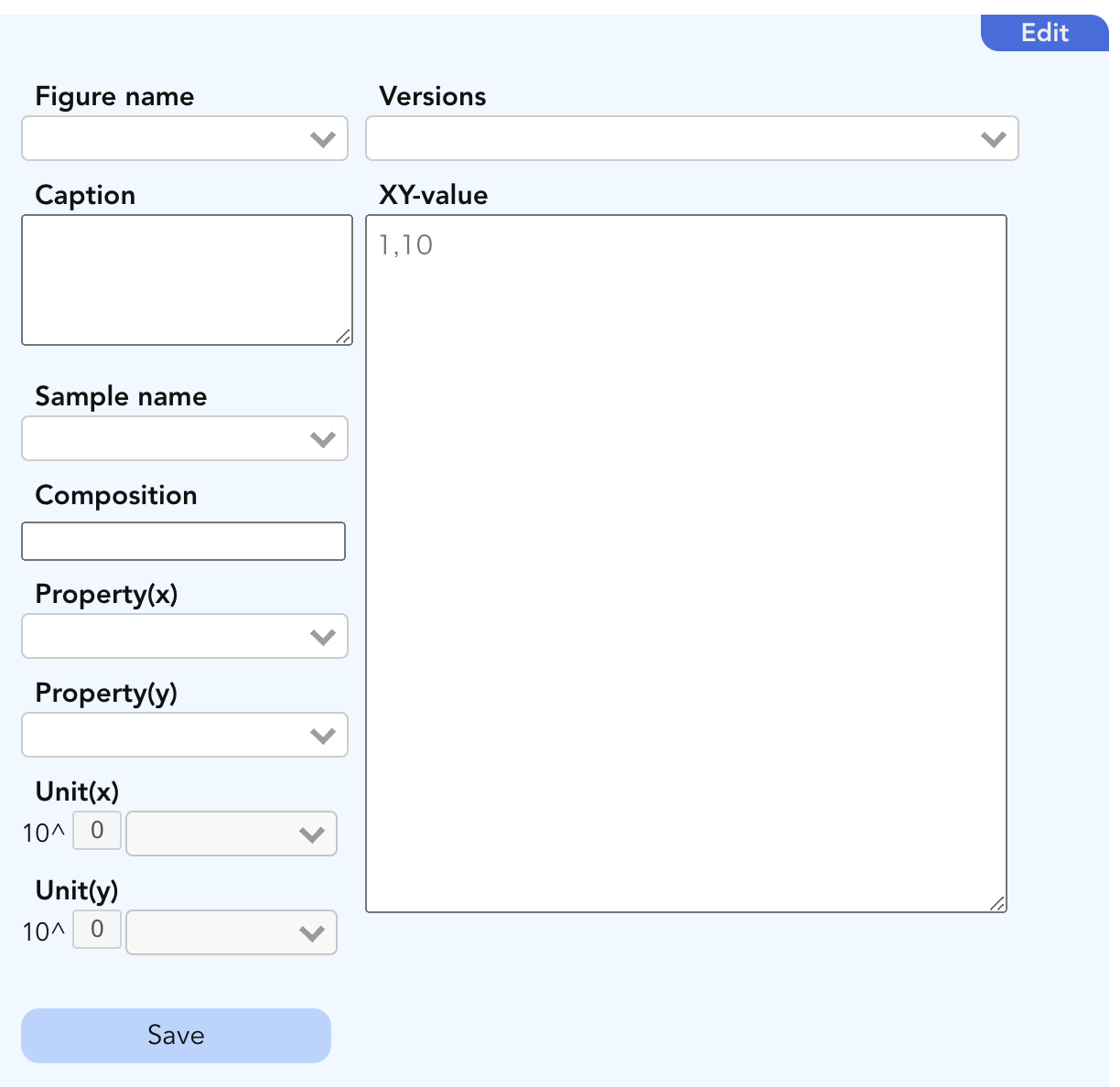
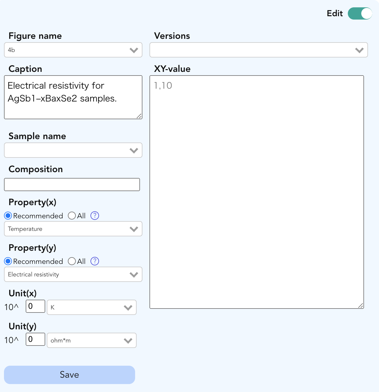
1-1. Deprecation of the “Official” Property and Introduction of the “Recommended” Property
Previously, The official property was provided on the data input screen for specific projects (e.g., thermoelectric materials). However, the following issues were identified:
- The meaning of official was not clear.
- It was displayed without distinguishing between the X-axis and Y-axis.
- When a user wanted to select a non-official property, it wasn’t easy because there were too many options to choose from among all properties.
To resolve these issues, the Official property has been deprecated and replaced with a Recommended property that can be set individually for the X-axis and Y-axis. Additionally, the All category has been sorted in natural order, making it easier to find the desired setting.
| Before | After |
|---|---|
|
|
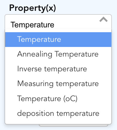
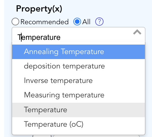
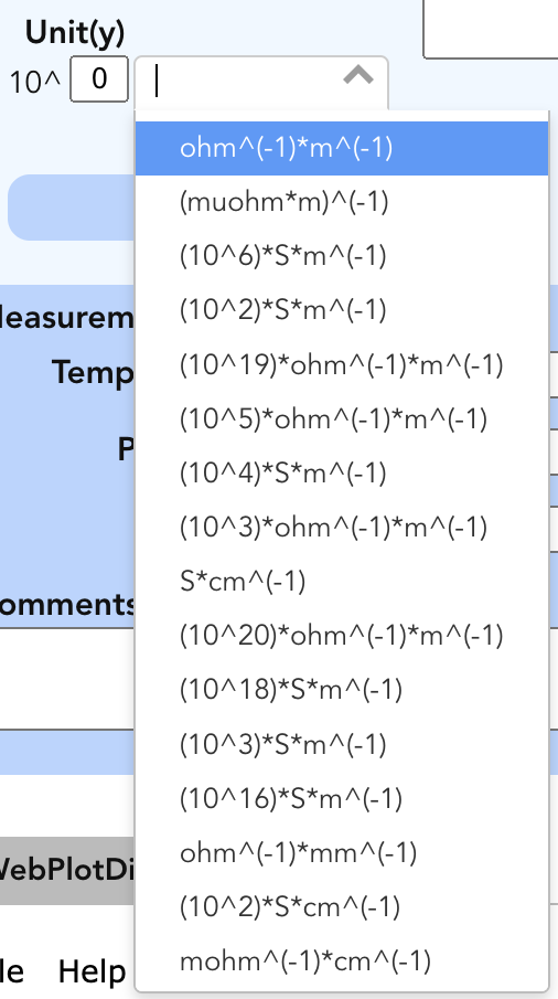
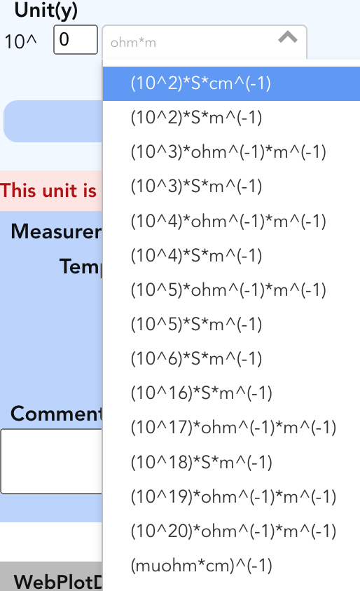
1-2. Changing the Order of Property and Unit Lists to Natural Order
For the display of property and unit lists, we have changed the sorting order from ASCII (for example, “10” coming before “1, 2, 3”) to natural order. This change allows users to find the intended items more intuitively.
Before and After Comparison of Property and Unit Lists
| Property Before | Property After |
|---|---|
|
|
| Unit Before (Electrical Conductivity) | Unit After |
|
|
2. Improvements to the Summary and Data Input Screens
2-1. Performance Improvements for the Summary Screen
By optimizing processes on both the frontend and backend, the summary screen’s initial rendering time has been significantly reduced.
Test Environment
- Browser: Google Chrome
- Chip: Apple M3 Max
- Memory: 128GB
- macOS: Sonoma 14.5
- Server: Starrydata2 Staging Environment (Plan/1Core-1GB)
- Data Volume: Figure 40, Sample 75, Curves 246 Open on Starrydata2
Initial Rendering Time (seconds)
| version | test 1 (s) | test 2 (s) | test 3 (s) | Average (s) |
|---|---|---|---|---|
| 2.4.4 | 4.89 | 5.28 | 5.04 | 5.07 |
| 2.5.0 | 1.90 | 2.00 | 2.23 | 2.04 |
The summary screen’s initial rendering has been accelerated approximately 2.5 times compared to the previous version (v2.4.4).
2-2. Introduction of a Loading Indicator
A loading icon has been introduced to visually indicate to users that the page is loading when the initial rendering takes time.
![]()
2-3. Introduction of an “Editing” Switch on the XY Data Input Screen
An editing switch has been added to the XY data input screen to clarify when a user is in editing mode. This enables users to understand their current editing state easily.
| Before | After |
|---|---|
|
|
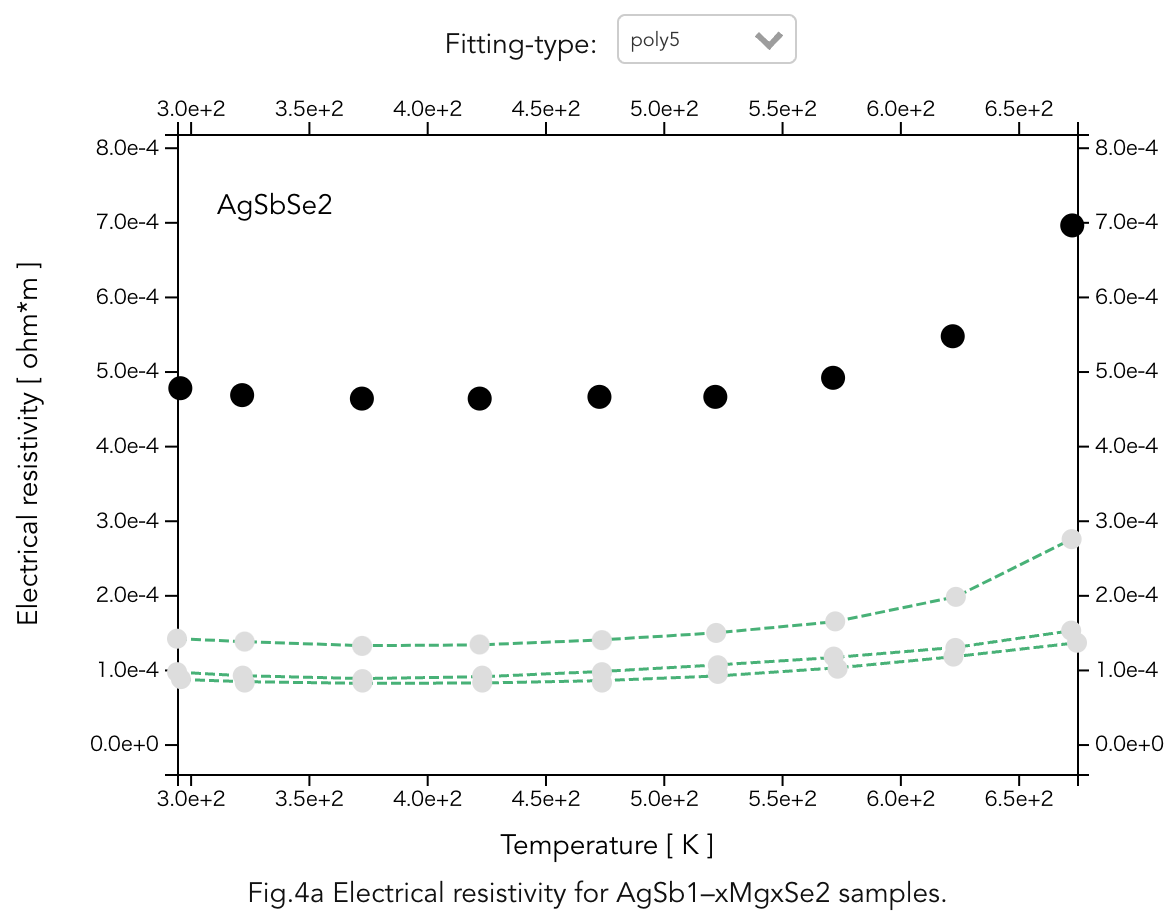
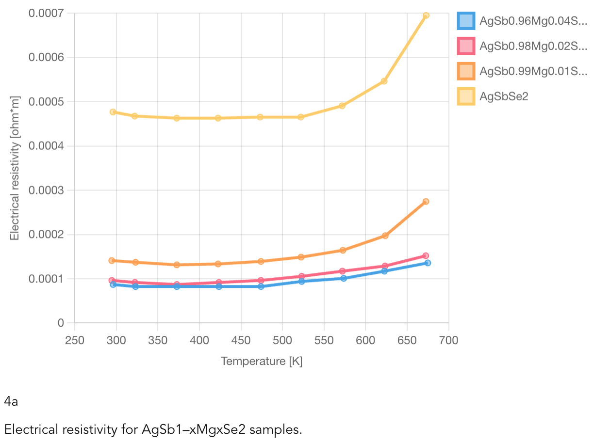
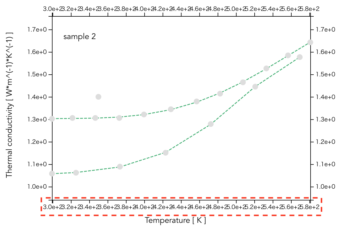
2-4. Redesign of the Graph Rendering on the XY Data Input Screen
To improve the readability of graphs, the following enhancements have been made:
- Distinct coloring for each sample to facilitate the identification of multiple data sets
- Addition of a legend to clearly display each sample name
- Connecting data points with lines to make trends more apparent
| Before | After |
|---|---|
|
|
- Dynamic Axis Formatting: Previously, axis values were uniformly displayed in exponential notation, making units like temperature hard to read. Now, the format adapts based on the value for improved clarity.
- Instant Data Updates: Data points entered in the input screen are now reflected immediately, eliminating the delay of waiting for the cursor to leave the text box or the Save button to be pressed.
3. Improvements to the Figure and Sample Lists
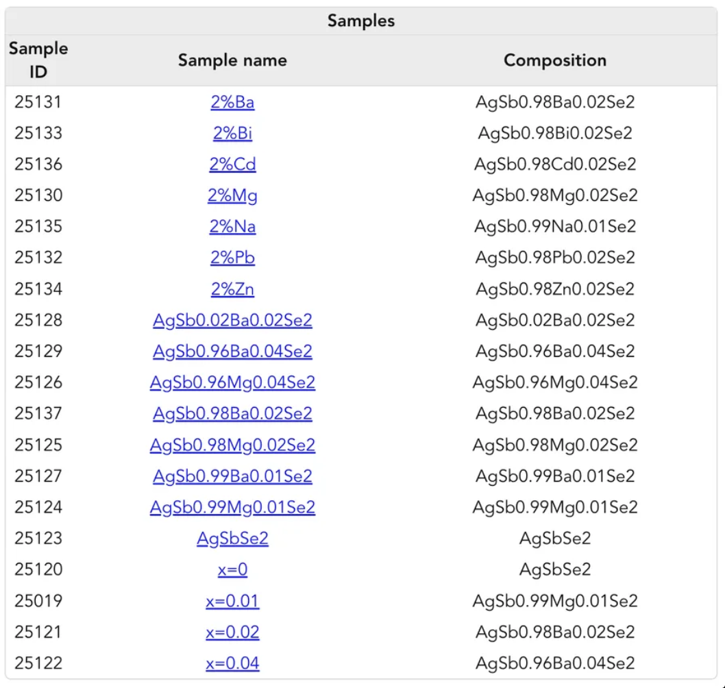
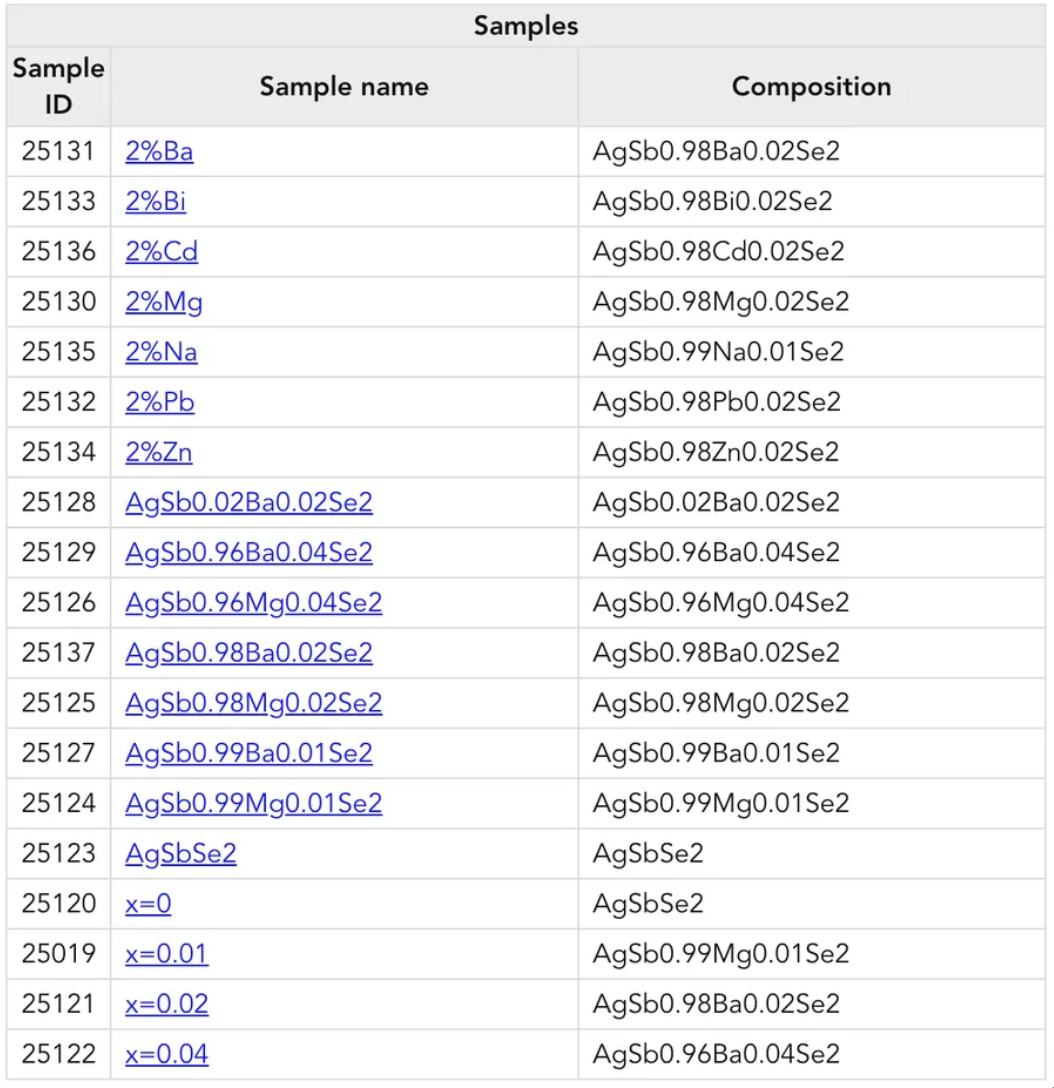
3-1. Unified Order and Display of Figure and Sample Lists
The samples’ ordering differed between the data input screen and the summary screen. This has been resolved by unifying the display order. Additionally, the sample names have been sorted in natural order to eliminate issues such as “10” appearing before “1, 2, 3.”
Other improvements include:
- Removal of units from the Figure properties → To improve table readability
- Changing table alignment from center to left → To enhance visual clarity
| Before (Figure) | After |
|---|---|
|
|
| Before (Sample) | After |
|
|
3-2. Improved Indication of Sample Data Availability When Selecting a Figure
When selecting a figure to choose a sample, it was previously unclear which samples contained data. This has been improved by displaying a ● mark next to sample names that have data associated with the selected figure, allowing users to identify which samples contain data immediately.
| Before | After |
|---|---|
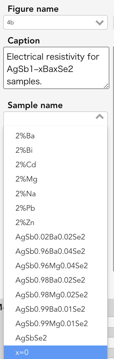
|
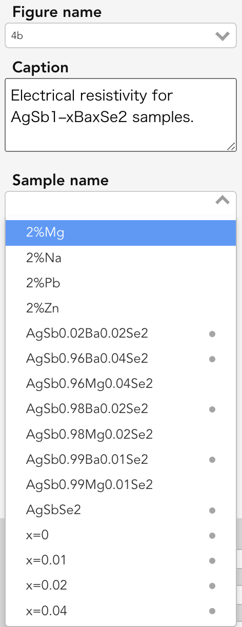
|
4. Minor Fixes
4-1. Fixed Overlapping of X-Axis Labels
Resolved an issue on narrow screens where adjacent X-axis labels overlapped, making the axis values difficult to read.
Code contributors: Tomoya Mato, Yu Takada